Tuesday, 10 May 2011
Friday, 8 April 2011
Wednesday, 6 April 2011
End Of Filming
This is what happened to us after we finished filming, we couldn't speak properly anymore.
Behind the Scene
Ziad doing his make up for the shot. He used face paint and fake blood to create this effect.
Ziad doing Millie's make up for her role, we wanted her to look like she has had a rough night and bumped her head, not more extreme than that.
We tried making prostetics using corn flower to give a scabby, torn flesh effect but it didn't quit work out.
After buying a fog machine we went to our location in a hotel corridor and fogged the corridor to give it a smokey effect when filming Ziad's role.
We climbed over gates to film in a private garden and this us tracking our filming.
This was our first time filming with lights (a proper set)
This is us on the set filming the scene when Poppy and Millie meet, we filled up Poppy's balloon with helium. The balloon represents her detachment, her soul is detached from her body and throughout the trailer you may notice the balloon is not present this is because we feel she should let go of the balloon after meeting the character Brooke as if she finally has let go of her soul.
This is on the set when we film the character Brooke walk on her way out to town before she bumps into the character Alice.
Editing our teaser
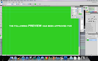
We created our own green screen using photoshop. We painted the background a appropriate green colour and added text.
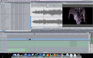
We made the voice over fit in time with the shots on screen.
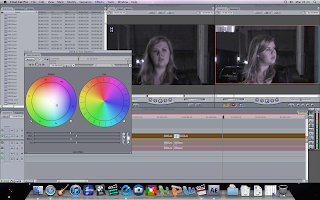
We corrected the colour to tone down the bright white colours and turn up the darker colours.
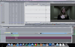
We recorded our own sounds and uploaded it cut and edited it to create a sound that will shock the audience when i run behind Millie.
The original shot from our trailer which we edited.
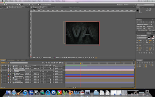
We created this using After effect software. By using different layers and using camera its created this effect which we used in our trailer.
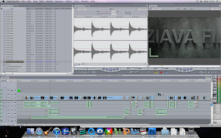
We then added sounds that introduced the text.
Monday, 4 April 2011
Poster
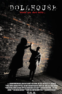
I felt the angle of the shot is very effective as it is not conventionally straight adds a sense of unease. I colour corrected the image by darkening the the light tones and brightening the dark tones and i removed the green tone which was on the floor so that it emphasise the character Alice and her shadow. The fact that she is connecting hands with the shadow will lead to many questions that the audience would be thinking and wanting to find out. Also the idea that her identity is hidden add mystery about the character similar to the villain in Nightmare on ElmStreet.
Practise Shots
We practised different camera angles and techniques such as shot reverse shot, high angle, low angle, panning and so on which we could use in our teaser.
Wednesday, 13 October 2010
Tuesday, 12 October 2010
Monday, 4 October 2010
The Orphan
I felt this trailer was the best to use for my own trailer as the child at first is percieved as innocent and the trailer doesn't give the secret behind the child away. In comparison to The villiage of the damned, we can see how horror movies have developed over the years, the use of graphics and sound that builds up to an event is more sinister than The villiage of the damned.
The Unborn
The felt the use of sound was very affective and matched what was viewed on screen. There was a clear climax in this trailer which made us feel insecure as an audience. I found the whispers of a child very freaky, i could use this element in my own teaser.
Monday, 10 May 2010
Monday, 29 March 2010
Wednesday, 24 March 2010
Analysing Contents Page
Check out this SlideShare Presentation:
Analysing Contents Page
View more presentations from guestaa9ee39d.
Contents Page Design
Check out this SlideShare Presentation:
Contents Page Design
View more documents from guest2286b8a.
Analysing Contents Page1
Check out this SlideShare Presentation:
Analysing Contents Page1
View more presentations from guestaa9ee39d.
D P S H A F I D
Check out this SlideShare Presentation:
D P S H A F I D
View more presentations from guestaa9ee39d.
Dps Photoshoot
Check out this SlideShare Presentation:
Dps Photoshoot
View more presentations from guest2286b8a.
Tuesday, 23 March 2010
Ava Khan Donaeomicroo [ Compatibility Mode]
Check out this SlideShare Presentation:
Ava Khan Donaeomicroo [ Compatibility Mode]
View more documents from guestaa9ee39d.
Ava Khan Donaeomicroo
Check out this SlideShare Presentation:
This was my filmed presentation powerpoint.
Ava Khan Donaeomicroo
View more presentations from guestaa9ee39d.
This was my filmed presentation powerpoint.
Dps Mac Dre
Check out this SlideShare Presentation:
Dps Mac Dre
View more presentations from guestaa9ee39d.
Monday, 22 February 2010
M:\Media Studies\The Making Of Font Cover
Check out this SlideShare Presentation:
M:\Media Studies\The Making Of Font Cover
View more presentations from guest4531f6.
Tuesday, 19 January 2010
Wednesday, 6 January 2010
First DRAFT
Thursday, 3 December 2009
Photoshoomusic Mag
Check out this SlideShare Presentation:
Photoshoomusic Mag
View more presentations from guest2286b8a.
Wednesday, 2 December 2009
Microsoft Word Music Magazine Layout
Check out this SlideShare Presentation:
Microsoft Word Music Magazine Layout
View more documents from guesta07bc5f.
Wednesday, 25 November 2009
Analysing Magazine Cover
Check out this SlideShare Presentation:
Analysing Magazine Cover
View more presentations from guest0e3e1d.
Analysing Magazine Cover Xxl
Check out this SlideShare Presentation:
Analysing Magazine Cover Xxl
View more presentations from guest2286b8a.
Tuesday, 24 November 2009
Mood Board
Check out this SlideShare Presentation:
I chose these artists as I would like to include them in my music magazine due to their talent, style and cultures; they are many people's idols.
Their style of music which ranges from R n B, Hip Hop etc is the genre I am aiming my music magazine to be like.
Mood Board
View more presentations from guesta07bc5f.
I chose these artists as I would like to include them in my music magazine due to their talent, style and cultures; they are many people's idols.
Their style of music which ranges from R n B, Hip Hop etc is the genre I am aiming my music magazine to be like.
Tuesday, 17 November 2009
Magazine Questionnaire[1]
Check out this SlideShare Presentation:
Magazine Questionnaire[1]
View more presentations from guest2e0a95.
Wednesday, 11 November 2009
Project Plan
Check out this SlideShare Presentation:
Project Plan
View more documents from guesta07bc5f.
Friday, 6 November 2009
Tuesday, 3 November 2009
Photoshoot 2
Check out this SlideShare Presentation:
Photoshoot 2
This is a plan for the photos i will be taking to include in my contents page, i will do this by personally taking the photo and then using adobe photoshop to edit my images until perfected.
View more documents from guesta07bc5f.
Contents Page Design
Check out this SlideShare Presentation:
Contents Page Design
This is my new and improved contents page i feel this design is m ore suitable for my magazine, more attractive and more magazine conventional.
View more documents from guesta07bc5f.
Monday, 2 November 2009
Contents Page
Check out this SlideShare Presentation:
Contents Page
I felt that my contents page was not very successful so i then designed another one that i felt was more affective for my magazine.
View more presentations from guesta07bc5f.
Wednesday, 28 October 2009
Wednesday, 21 October 2009
Evaluation
Check out this SlideShare Presentation:
Evaluation
View more presentations from guesta07bc5f.
Saturday, 10 October 2009
Photoshop tools
Friday, 9 October 2009
Magazine Analysis
Check out this SlideShare Presentation:
Magazine Analysis
View more documents from guestfefbd390.
School Magazine Comparison
Check out this SlideShare Presentation:
School Magazine Comparison
View more presentations from guestfefbd390.
My Magazine Cover

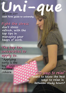

This is my magazine cover, i enjoyed this task a lot as i have never made my own magazine cover. I firstly edited my image, i cloned the '1' sign and the plug socket as it was not necessary. I then used guissian blurr to blur the whole image however, i wanted to unblurr the model aswell as one book, i did this by using the tool.... Once the image was ready i started to add my mastehead, coverlines and explanatory lines.
Monday, 5 October 2009
Topman
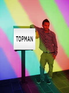

In this task i decided to make this image into an advertisement for Kalivin Klein clothes. Firstly, i decided to make this image eye catchy so i painted the image with many bright colours. I needed to make the colours partially transparent so we can see the model, i did this by using...
I then needed a Calvin Klein logo so i search on google to find an image, i then inserted the image on the colours, so it can stand out from the colours and draw attention to the black and white logo.
Cloned School
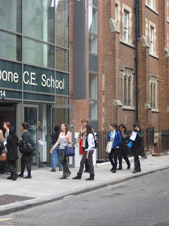

This is the original image of the entrance to St Marylebone, i then cloned this image using adobe photoshop. i cloned various objects such as the security camera (middle right), the yellow line on the road, the st mary
lebone sign (middle top), a builder (bottom right), a man's arm who is at the door (bottom left) and i also decreased the size of his body. i enjoyed cloning the builder as i challenged my skills as i needed to look closer at the detail that i cloned to make it look realistic.
Model's Face
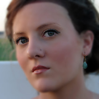
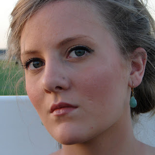
I enjoyed using adobe photoshop to emphasise the parts of the model's face i wanted to.
To enhance this model's beauty i cloned her impurities such as her spots, any dark areas and her scar. I also used guissian blurr to make her face look air brushed, and using a tool to un-blur the main features such as her eyes, nose stud, earrings, eyebrows, lips and a lien on her nose to add a lighting effect. I also made her hair darker, near to a brown colour, by using starting a new layer, i painted the hair and then used "soft light" to make it seem more realistic. I did this by changing the opacity of the layer; i did the same to lighten her eyes.
Subscribe to:
Posts (Atom)


.JPG)


